mardi 15 mai 2012

Résultats du second tour: Nature du vote et Distance au littoral

Article en français

French elections: nature of votes versus distance to the coast : In the previous post, we saw how to make a simple choropleth of votes. Here, I detail how to create a dataviz combining a map and a standard xy plot to visualize the relation that exists between the nature of votes and the distance to the coast. A good opportunity to use a very interesting R library: spatstat.


dimanche 13 mai 2012

Résultats du second tour: ma première choroplèthe avec R


 article en français

French elections - my first choropleth with R : Many journalists say that the electoral campaigns are becoming "data campaigns". The candidates are fighting, making massive use of numbers. They're looking for the number that will make the other one wrong. They're speaking numbers, displaying plots, graphics - interactive or not - about what the actual state of the country is, and how they intend to change it. Why not taking the most of the elections data to learn how to make a simple choropleth with R?

The entire code is available for download at the end of the article


Dans cet article, nous allons créer une petite choroplèthe des résultats du second tour des élections présidentielles.

dimanche 8 avril 2012

Le carroyage avec QGIS et le plugin QMarxan, c'est facile!

Article en français 

Gridding Paris with OpenStreetMap data
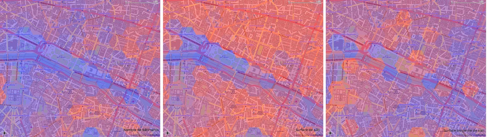
"Gridding for the dummies" ;) with Quantum GIS and QMarxan: In this article, I explain the purpose of gridding, why it is such an efficient way to analyse data within a large community of actors. Actually, gridding can be considered as a transcription of the raster format to the vector one where one tile <=> one cell. Thanks to QMarxan, gridding with QGIS is really simple:  you don't need any knowledge in PostGIS, GRASS and R to do it. That's what we'll see: in the end of the post, I detail how to constitute some gridded data through a case study aiming to process a building density analysis on the city of Paris. The article is in French, but the printscreens will be helpful for the understanding. 

All the material used in this article is free: Quantum GIS, OpenStreetMap for the buildings and INSEE (equivalent of US Census) for the population data.

lundi 12 mars 2012

Archipels de prospérité

Article en français

archipels de prospérité
Archipelagos of Prosperity test: Previously, I had mentioned a map of prosperity in France that created a buzz amongst the R community. Following the idea of mapping sociological indicators, I tested a few ways of mixing ordinal and geographical visualizations in these posts (the 1st and the 2nd). Prosperity is an actual topic in our period of crisis. I imagined a way of representig prosperity on a map, besides the choropleth and the cartogram. For the creation below, I took inspiration on a book cover that figured a chart as a fictive landscape and based on my observation of islands of prosperity on Coulmont's map, I imagined France as an oniric landscape made of archipelagos, lagoons. This exotic vision contrasts with the toughness of the subject.

jeudi 9 février 2012

[3maps # 1] European Travel Patterns, the true size of Africa, if 7 Billion...

In the 3maps series, I'll try to share with you, each month, a selection of 3 interesting maps that I'll have found on the web.


Connecting

European Travel Patterns by Eric Fischer

European travel patterns

European travel patterns by Eric Fischer


We find more and more maps representing connections from social websites like Twitter or Facebook. These maps are interesting to watch because of their dynamics. Also, they successfully unveil some connectedness aspects in the real world.