lundi 12 mars 2012

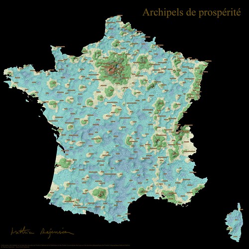
Archipels de prospérité

Article en français

archipels de prospérité
Archipelagos of Prosperity test: Previously, I had mentioned a map of prosperity in France that created a buzz amongst the R community. Following the idea of mapping sociological indicators, I tested a few ways of mixing ordinal and geographical visualizations in these posts (the 1st and the 2nd). Prosperity is an actual topic in our period of crisis. I imagined a way of representig prosperity on a map, besides the choropleth and the cartogram. For the creation below, I took inspiration on a book cover that figured a chart as a fictive landscape and based on my observation of islands of prosperity on Coulmont's map, I imagined France as an oniric landscape made of archipelagos, lagoons. This exotic vision contrasts with the toughness of the subject.

jeudi 9 février 2012

[3maps # 1] European Travel Patterns, the true size of Africa, if 7 Billion...

In the 3maps series, I'll try to share with you, each month, a selection of 3 interesting maps that I'll have found on the web.


Connecting

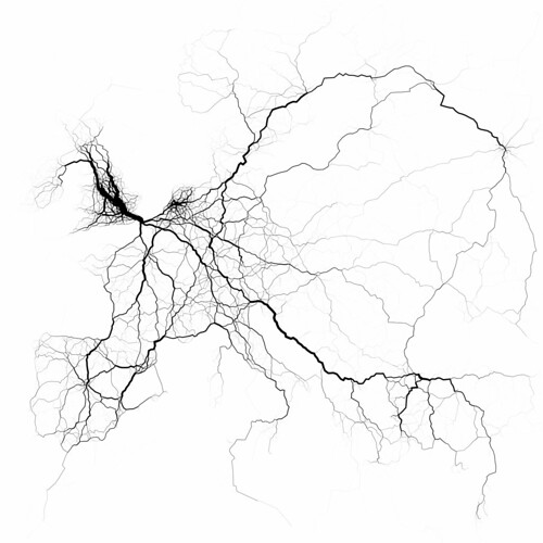
European Travel Patterns by Eric Fischer

European travel patterns

European travel patterns by Eric Fischer


We find more and more maps representing connections from social websites like Twitter or Facebook. These maps are interesting to watch because of their dynamics. Also, they successfully unveil some connectedness aspects in the real world.

dimanche 22 janvier 2012

Classement du niveau de vie des départements: autre proposition de représentation

Here is a new attempt of associating the rank of a department's life level with its spatial location. It illustrates the flexibility of R in merging maps with numbers.

Auparavant, afin de pouvoir associer le rang d'un département à sa localisation, je vous avais proposé une représentation figurant le classement sous forme de trajet.

Je vous en offre une autre qui est plus lisible selon moi. Sur celle-ci, le classement figure de part et d'autre et chaque département est colorié selon son classement, du bleu au jaune.


jeudi 19 janvier 2012

Une petite carte socio : niveau de vie des départements


A sociological map: life level of each department in FranceThis map is inspired by the work of Baptiste Coulmont on the richness of cities in France and by the work of Robert Kosara's ZipScribbleMaps on representing the order of zip codes on a map. It explains the process behind the creation of what I would call an "ordinal" map. Do you find this visualization interesting, boring, useful, useless? Don't hesitate to comment.


Carte de la prospérité en France

Il n'y a pas longtemps, je suis tombé sur cette carte de Baptiste Coulmont avec une représentation de la prospérité sur la France Entière. Cette carte assez remarquable a été relayée sur pas mal de sites, notamment liés au logiciel R.

La carte est le fruit du croisement entre les données géogaphiques GEOFLA et des données sur les revenus et salaires de l'INSEE. Ces deux données sont en libre téléchargement sur les sites de ces institutions.

Ce qui rend cette carte intéressante, selon moi, c'est:
- la thématique de la richesse/précarité qui est d'actualité en cette période de crise.
- la façon dont elle est représentée avec une palette de couleur divergente allant du rouge au bleu

samedi 31 décembre 2011

[fr] Talend Chef d'Orchestre d'un Traitement Raster: Découpage du Cadastre par Commune

Dans un précédent post, je vous avais fait part des possibilités offertes par Talend pour l'orchestration de traitements GDAL.

Ici, nous allons voir un cas d'étude bien particulier relatif à une chaîne de traitement raster visant à constituer de manière automatisée un ensemble de dalles cadastrales sur la région PACA, soit 963 dalles (car 963 communes).