
Connecting
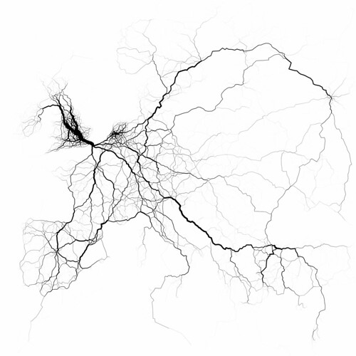 |
European travel patterns by Eric Fischer |
We find more and more maps representing connections from social websites like Twitter or Facebook. These maps are interesting to watch because of their dynamics. Also, they successfully unveil some connectedness aspects in the real world.
One of the artists I appreciate in this domain is Eric Fischer. His work is mainly based on Twitter and cabspotting data.
This map was created this way:
"60,000 trips (of 20 or more miles each) through 750,000
randomly-chosen geotags, grouped with 10-mile radius, from the Twitter
streaming API, August, 2011."
Eric Fischer is a Twitter Mapper virtuoso. In this map, he manages to transform massive virtual data into a river-like landscape.
Comparing
 |
The true size of Africa by Kai Krause |
With the map above, you can really figure out how big Africa is.
If 7 Billion People Lived In One City, How Big Would It Be?
 |
If 7 billion by Tim De Chant
As one's always attempted to compare things relative to one's own
references, relativeness is an efficient way to represent data. In a different manner from the map of Africa, this
concept is used in the map above where it takes the population
density in different main cities in the world and apply the 7 billion
world's population to USA to see how it would fit. It gives an idea on the different densities of cities in the world and on how space can be saturated to the maximum.
|
Aucun commentaire:
Enregistrer un commentaire