 Cet article parle du texte dans les cartes.Loin d'être un élément polluant, le texte peut véhiculer toute une palette de formes esthétiques ainsi que favoriser la perception de valeurs statistiques. Certaines réalisations cartographiques ne sauraient se passer de lui. C'est le cas d'une carte que nous essaierons de concevoir au sein de cet article au sujet de la dénomination des communes, de leur "son". Avant cela, nous aurons tenté d'introduire, modestement, l'univers des cartes typographiques.
mardi 18 septembre 2012
Les cartes typos, comment sonnent les communes de votre région?
Cet article parle du texte dans les cartes.Loin d'être un élément polluant, le texte peut véhiculer toute une palette de formes esthétiques ainsi que favoriser la perception de valeurs statistiques. Certaines réalisations cartographiques ne sauraient se passer de lui. C'est le cas d'une carte que nous essaierons de concevoir au sein de cet article au sujet de la dénomination des communes, de leur "son". Avant cela, nous aurons tenté d'introduire, modestement, l'univers des cartes typographiques.mercredi 15 août 2012
[Sextante Plugin] An R script for Neighborhood Detection
 |
| Des bâtiments regroupés en bloc à Paris |
[Plugin Sextante] Un script R pour détecter les voisinages : Cet article explique comment réaliser un petit script R via le plugin Sextante pour QGIS afin d'établir des relations de voisinage entre objets en fonction de la distance qui les sépare. Il comporte une petite introduction sur l'écosystème QGIS, sur R aussi. Et puis bien sûr, des détails sur l'écriture d'un script R pour le plugin Sextante GIS Plugin.
dimanche 8 juillet 2012
Isarithmic Map of French Votes: Why and How-to

Article in English
Cartes isarithmiques: pourquoi les utiliser et comment les réaliser? Cet article explique l'intérêt des cartes isarithmiques, pourquoi elles réussissent là où d'autres types de visualisation échouent. En réalité, la création de cartes isarithmiques est un procédé original dans le domaine de la géomatique, de la cartographie en général, se basant sur des masques continus et non binaires. L'article explique les principes techniques de telles réalisations et délivre le code à la fin du post.
jeudi 21 juin 2012
Résultats gagnants par circonscription du 2nd tour des élections législatives 17 juin 2012 - Fichier Remanié d'après Data Publica

Ce fichier est très complet et permet d'avoir les résultats pour chaque circonscription relatives aux différents partis.
J'ai voulu créer un fichier remanié ne faisant apparaître que les gagnants. Le voici en téléchargement au format csv:
Plan:
- Pourquoi remanier le fichier
- Quel métier exercent les candidats ayant remporté les élections législatives?
- Autres explorations
- Petits camemberts
- Triangulaires
- Abstention
- Extrême-Droite
- Les éléments clés du code ayant permis cette transformation
- Le code R sous github
mardi 12 juin 2012
HeatMap Profession ~ Parti des candidats aux élections législatives et contribution au khi-deux (suite)
Dans le précédent post, nous avons déjà vu quelques notions permettant d'analyser le lien entre la profession exercée par les candidats aux élections législatives et leur appartenance politique.
Nous aurions pu compléter l'analyse des correspondances grâce à une petite heatmap montrant les effectifs et leur aspect significatif..

Dans cette heatmap, l'intensité de la couleur est relative à la valeur du khi-deux de la cellule (issue du couplage de deux modalités, Profession et Parti). Plus la valeur est élevée entre ces deux modalités et plus leur correspondance est élevée.
Nous aurions pu compléter l'analyse des correspondances grâce à une petite heatmap montrant les effectifs et leur aspect significatif..
Plan:
- La HeatMap
- Calcul du khi-deux, explications
- Les éléments-clé du code
- Le code complet sous github
La heatmap
Dans cette heatmap, l'intensité de la couleur est relative à la valeur du khi-deux de la cellule (issue du couplage de deux modalités, Profession et Parti). Plus la valeur est élevée entre ces deux modalités et plus leur correspondance est élevée.
mercredi 6 juin 2012
Législatives 2012: Activité Professionnelle et Appartenance Politique
Ici, nulle géographie, nous allons exploiter les données du fichier des élections législatives. Il est téléchargeable à cette adresse:
http://www.data-publica.com/data/13587--liste-des-6603-candidats-aux-elections-legislatives-des-10-et-17-juin-2012
Ce fichier a déjà fait l'objet d'analyses sur des blogs:
http://www.data-publica.com/data/13587--liste-des-6603-candidats-aux-elections-legislatives-des-10-et-17-juin-2012
Ce fichier a déjà fait l'objet d'analyses sur des blogs:
- sur les prénoms des candidats
- sur la relation avec la suppléance en terme d'écart d'âge
- sur la parité homme-femme
- sur les professions des candidats socialistes et UMP
Plan:
- Tableau de contingence et visualisation
- Classification hiérarchique
- Analyse Factorielle des Correspondances
mardi 15 mai 2012
Résultats du second tour: Nature du vote et Distance au littoral
Article en français

dimanche 13 mai 2012
Résultats du second tour: ma première choroplèthe avec R

article en français
French elections - my first choropleth with R : Many journalists say that the electoral campaigns are becoming "data campaigns". The candidates are fighting, making massive use of numbers. They're looking for the number that will make the other one wrong. They're speaking numbers, displaying plots, graphics - interactive or not - about what the actual state of the country is, and how they intend to change it. Why not taking the most of the elections data to learn how to make a simple choropleth with R?
The entire code is available for download at the end of the article
Dans cet article, nous allons créer une petite choroplèthe des résultats du second tour des élections présidentielles.
dimanche 8 avril 2012
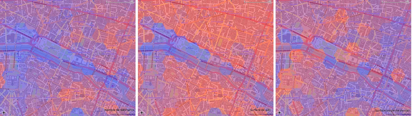
Le carroyage avec QGIS et le plugin QMarxan, c'est facile!
Article en français
 |
| Gridding Paris with OpenStreetMap data |
"Gridding for the dummies" ;) with Quantum GIS and QMarxan: In this article, I explain the purpose of gridding, why it is such an efficient way to analyse data within a large community of actors. Actually, gridding can be considered as a transcription of the raster format to the vector one where one tile <=> one cell. Thanks to QMarxan, gridding with QGIS is really simple: you don't need any knowledge in PostGIS, GRASS and R to do it. That's what we'll see: in the end of the post, I detail how to constitute some gridded data through a case study aiming to process a building density analysis on the city of Paris. The article is in French, but the printscreens will be helpful for the understanding.
All the material used in this article is free: Quantum GIS, OpenStreetMap for the buildings and INSEE (equivalent of US Census) for the population data.
lundi 12 mars 2012
Archipels de prospérité
Article en français
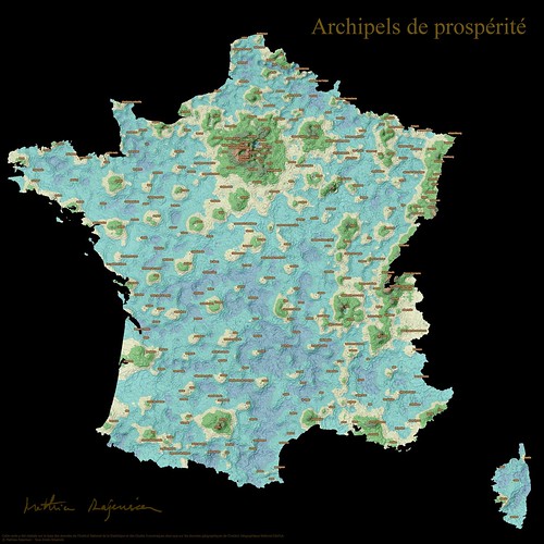
Archipelagos of Prosperity test: Previously, I had mentioned a map of prosperity in France
that created a buzz amongst the R community. Following the idea of
mapping sociological indicators, I tested a few ways of mixing ordinal
and geographical visualizations in these posts (the 1st and the 2nd).
Prosperity is an actual topic in our period of crisis. I imagined a way
of representig prosperity on a map, besides the choropleth and the cartogram. For the creation below, I took inspiration on a book cover
that figured a chart as a fictive landscape and based on my observation
of islands of prosperity on Coulmont's map, I imagined France as an
oniric landscape made of archipelagos, lagoons. This exotic vision
contrasts with the toughness of the subject.
jeudi 9 février 2012
[3maps # 1] European Travel Patterns, the true size of Africa, if 7 Billion...
In the 3maps series, I'll try to share with you, each month, a selection of 3 interesting maps that I'll have found on the web.
European Travel Patterns by Eric Fischer
We find more and more maps representing connections from social websites like Twitter or Facebook. These maps are interesting to watch because of their dynamics. Also, they successfully unveil some connectedness aspects in the real world.
Connecting
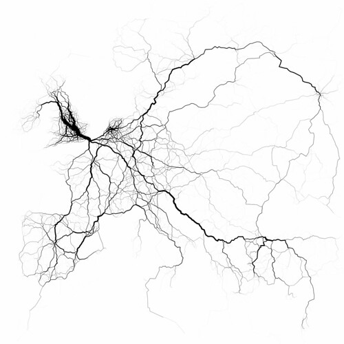 |
European travel patterns by Eric Fischer |
We find more and more maps representing connections from social websites like Twitter or Facebook. These maps are interesting to watch because of their dynamics. Also, they successfully unveil some connectedness aspects in the real world.
dimanche 22 janvier 2012
Classement du niveau de vie des départements: autre proposition de représentation
Here is a new attempt of associating the rank of a department's life level with its spatial location. It illustrates the flexibility of R in merging maps with numbers.
Auparavant, afin de pouvoir associer le rang d'un département à sa localisation, je vous avais proposé une représentation figurant le classement sous forme de trajet.
Je vous en offre une autre qui est plus lisible selon moi. Sur celle-ci, le classement figure de part et d'autre et chaque département est colorié selon son classement, du bleu au jaune.
jeudi 19 janvier 2012
Une petite carte socio : niveau de vie des départements

A sociological map: life level of each department in France. This map is inspired by the work of Baptiste Coulmont on the richness of cities in France and by the work of Robert Kosara's ZipScribbleMaps on representing the order of zip codes on a map. It explains the process behind the creation of what I would call an "ordinal" map. Do you find this visualization interesting, boring, useful, useless? Don't hesitate to comment.
Carte de la prospérité en France
Il n'y a pas longtemps, je suis tombé sur cette carte de Baptiste Coulmont avec une représentation de la prospérité sur la France Entière. Cette carte assez remarquable a été relayée sur pas mal de sites, notamment liés au logiciel R.
La carte est le fruit du croisement entre les données géogaphiques GEOFLA et des données sur les revenus et salaires de l'INSEE. Ces deux données sont en libre téléchargement sur les sites de ces institutions.
Ce qui rend cette carte intéressante, selon moi, c'est:
- la thématique de la richesse/précarité qui est d'actualité en cette période de crise.
- la façon dont elle est représentée avec une palette de couleur divergente allant du rouge au bleu
Inscription à :
Articles (Atom)